Pantone Announces Their 2020 Color Of The Year
Now that we are starting in the 2020s, we get a fresh start and you may want to consider celebrating with a fresh coat of paint.

It’s hard to believe that we are actually about to turn the odometer over to a new decade. Now that we are starting in the 2020s, we get a fresh start and you may want to consider celebrating with a fresh coat of paint. If you are looking for the ultimate color for the decade, you might want to check out the 2020 Pantone Color of the Year.
In December, 2018, the company picked Living Coral as the color for 2019. In part, they chose the color because it was a “reaction to the onslaught of digital technology and social media increasingly embedding into daily life, we are seeking authentic and immersive experiences that enable connection and intimacy.” Going back a year earlier to 2018, you could’ve enjoyed Ultraviolet or in 2017, Greenery.
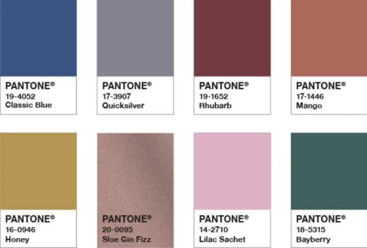
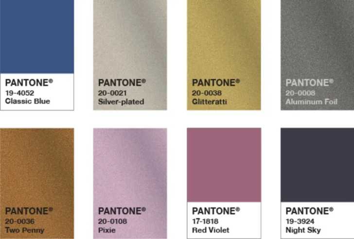
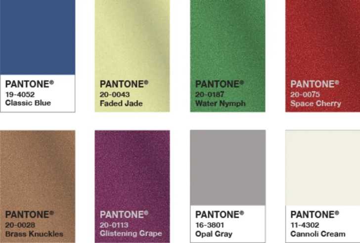
So what is the 2020 color of the year from Pantone? It is ‘classic blue’.
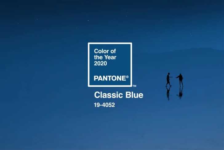
Most people love the color blue but this shade has the benefit of being ‘elegant in its simplicity’ and ‘timeless and enduring’.
“We are living in a time that requires trust and faith. It is this kind of constancy and confidence that is expressed by PANTONE 19-4052 Classic Blue, a solid and dependable blue hue we can always rely on,” Leatrice Eiseman, Executive Director of the Pantone Color Institute, says in a press release.
“We need something that provides us with an anchoring foundation,” Eiseman tells Apartment Therapy. “Blue is just that kind of color…it’s restful, it’s resilient, it’s not aggressive.”
Classic blue is a color that will always be a favorite. It’s the color of the perfect sky that belongs in everybody’s Instagram pictures. Eiseman says: “A boundless blue evocative of the vast and infinite evening sky, [it] encourages us to look beyond the obvious to expand our thinking; challenging us to think more deeply, increase our perspective and open the flow of communication.”
Color also helps us to communicate in our fast-paced world.
“As technology continues to race ahead of the human ability to process it all, it is easy to understand why we gravitate to colors that are honest and offer the promise of protection. Non-aggressive and easily relatable, the trusted Classic Blue lends itself to relaxed interaction. Associated with the return of another day, this universal favorite is comfortably embraced.”
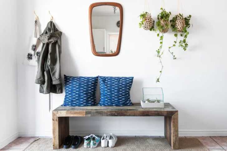
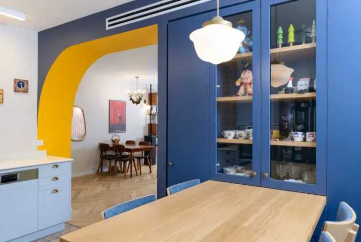
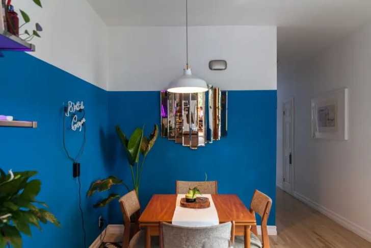
Some people may consider Classic Blue to be a safe color but in reality, it’s a timeless color. You can add it into your existing colors or build around it for something truly amazing. It works well with any of Pantone’s curated palettes:
Pantone is quick to admit that there are many options available for 2020:
“Classic Blue injects creative confidence into interiors, transforming a space through unique color combinations and tonal statements. Easily applied across so many different materials, textures and finishes, PANTONE 19-4052 Classic Blue is a dependable blue that can take you in different directions expressing tradition and elegance as well as unexpected boldness.”
More to Explore
SKM: below-content placeholderWhizzco for CRH